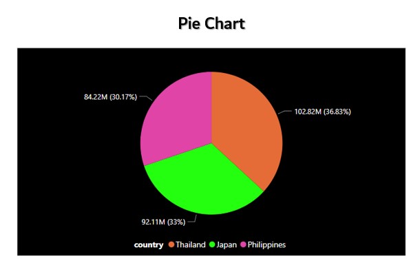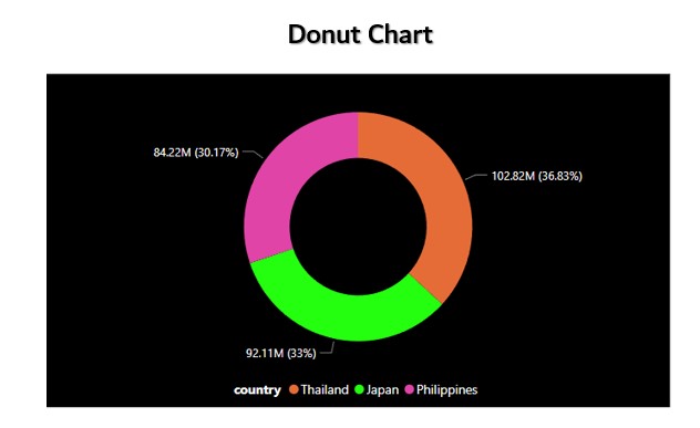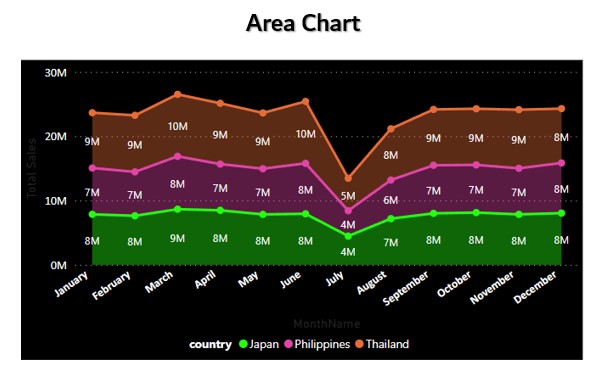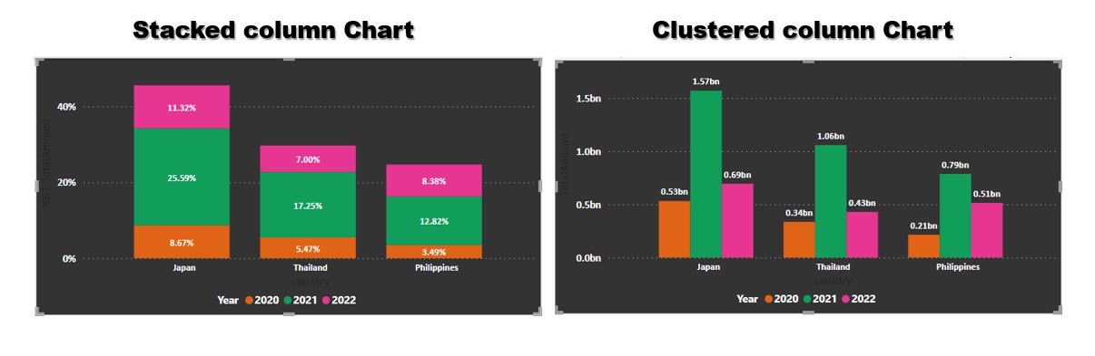
Column Chart are used to show the measures across various dimensions. Let us consider the table where we have a dimension or qualitative (Category) and measure or quantitative (value).This type of chart is useful when we want to show how the measures are distributed across a single dimension.
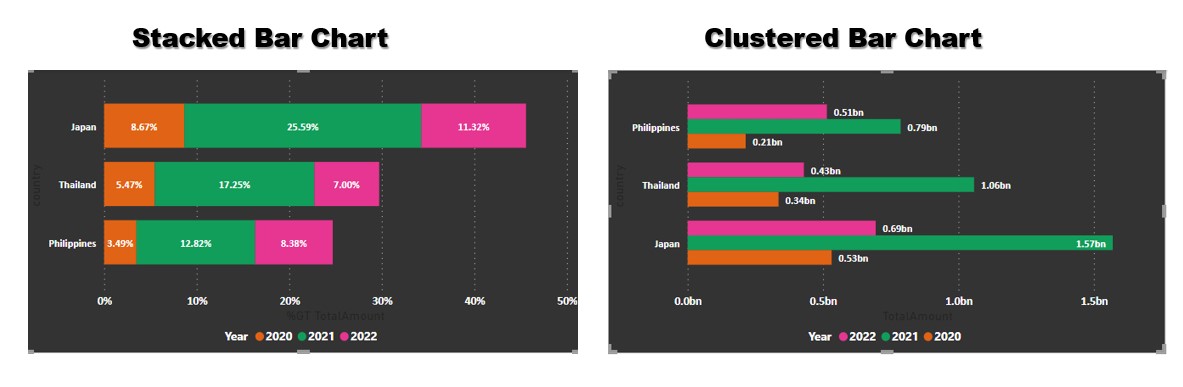
- Stacked column chart-percentage of sales by different sales person across each regions of sales.
- Clustered column chart-sales by different sales man across different regions is a typical example